
All pictures taken in natural light without flash.


So supposedly, these Aurorized Eyes got a lot of hype because they look similar to the Geminate Eyes (will review next) that was super popular. Well, let's just say both of these lines did not disappoint, although I'll save Geminate Eyes for last because, well, I like it best ^.^
The Aurorized Eyes are gorgeous! Pigmentation is excellent, down to the sparkling top wash (center) that doubles as a lid shade. Yes, it's sparkly, but as with other Lunasol standards it's not chunky glittery or garish. The texture is better than 15th Anniversary Eyes, Lighting for Eyes, and Sheer Breeze Eyes, softer and smoother, but still not buttery like Vivid Clear Eyes or Party Eyes 2014 EX01. That said, the colors and finishes more than compensate for that. The finishes are metallic pearl for 03 Gentle Variation and metallic for 05 Contrast Variation, but all the colors are super wearable even for me who rarely reaches for greens and blues. I might have to go back for more colors, that's how much I like it ^.^
- 03 Gentle Variation: the left photo below is more accurate than the right, which got washed out a little and makes the palette looks cooler-toned than it is. This palette is more neutral despite the green and blue shades, as shown at left. And because it's more neutral that it works for me, as I much prefer a bluish or olived golden green over green green.


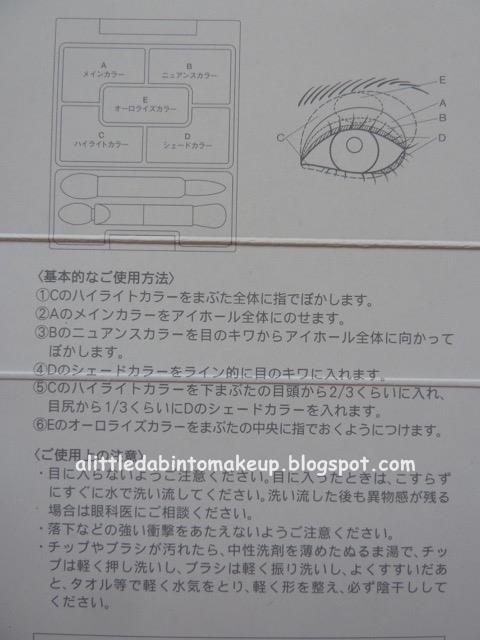
Clockwise from center:
- Sparkling top wash: high shimmer metallic pearl, low intensity. A sparkling soft white (and not as bleached white as above white) that's more opaque when looked at directly and more translucent when seen at an angle.
- Medium crease: metallic, medium intensity. A jaded green with a metallic gold sheen.
- Lid: metallic pearl, medium intensity. A pretty canary gold.
- Liner: shimmer, high intensity. A deep forest green with gold shimmers.
- Base/highlighter: metallic pearl, low intensity. A beautiful translucent ivory that reflects a more opaque metallic gold champagne sheen when seen at an angle, sort of the opposite as the sparkling top wash above.


- 05 Contrast Variation: just my humble opinion, but hands down this palette is the star of the whole Aurorized Eyes range. I mean, just look at it! This is a beige-rose gold palette that looks like it would be warm in the pan but is quite neutral on me. And that liner shade at bottom right totally took me by surprise when I swatched it: ...it's a blackened bluish purple! I know it looks blue in the photos, but trust me it's purple, which makes perfect sense in the context of the color scheme. Love this palette so much!


Clockwise from center:
- Sparkling top wash: high shimmer metallic pearl, low intensity. A metallic cream with a sparkly pearly pink sheen. It's more opaque when looked at directly and more translucent when seen at an angle.
- Medium crease: metallic, medium intensity. A gorgeous rose gold that's just perfect on its own. Love love love!
- Lid: metallic, medium intensity. A metallic beige, again perfect on its own. More love!
- Liner: shimmer, high intensity. A blackened bluish purple that makes a beautiful liner. Even more love! You can sort of see a hint of purple in the left swatch photo below, but otherwise it looks blue in every picture I've seen until I swatched it in natural light, at which point the purple shows up and gave me whiplash, in a good way ^.^
- Base/highlighter: metallic pearl, low intensity. A pretty translucent creamy beige that reflects a more opaque metallic sheen when seen at an angle, again the opposite as the sparkling top wash.


2 comments:
Oh, it looks like you dabbled across the whole range(I was totally thinking about passion breeze collection until I saw your review)...my favorite in this is the pink one(contrast variation)but I like that rose gold as well...actually right now I am just looking around to see if I can score the discontinued layer bloom eyes somewhere since I really like the purple gradation.
Hey Citrine!
Yes, I love, love, love this Contrast Variation palette! The rose gold is gorgeous!
I've seen a few reviews of the Layer Bloom Eyes. They're pretty, although lots of pastels. When you try that Lavender Coral, tell me how you like it, okay? I've read that the deep purple shade in that quad is matte, although it looks pretty darn sparkly to me!
Cheers,
D.
Post a Comment