Encouraged by the Lavshuca Star Decoration Eyes, I gave the Melting Eyes a try despite the horror movie title. Melting eyes? Eeeps. At least the compacts are lithe and pretty ^.^'
BE-1 and BR-1. All pictures taken in natural light without flash.


These are available in 5 colors, PK-1, RD-1, OR-1, BR-1, and BE-1. As the color names suggest, they are all warm with the exception of BR-1 that is more or less neutral. I'm not sure why Lavshuca would do this, as warm palettes are not for everyone and most eye shadow ranges will include at least one cool combo. The funny thing is, while I am warm myself, warm palettes usually turn very red on me. So I tend to stick with neutrals and cools unless I really love something enough to venture into the warmer spectrum.
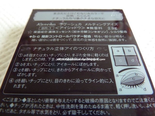
All that is to say I am slightly disappointed with the colors available for these Melting Eyes. But even then, in good faith I picked up 2 palettes, BE-1 and BR-1. Prior to buying I have read that these aren't sparkly like the average Japanese palette, so I was mentally prepared for the possible blandness ^.^ They turn out to be similar to the Kiss Kiss My Eyes Glamorize Shadows. The Kiss palettes still take the cake in terms of silky texture, but these Melting Eyes are pretty soft too and very pigmented. Over all they're decent and will put my other sparkly top washes to good use, but I won't be buying anymore of them. If you're looking for less shimmery eye shadows to wear to the office, unless you're a big Lavshuca fan I recommend the Kiss palettes instead. They're cheaper, they give the same result with better texture, and there are at least 2 neutral combos available out of 6 choices versus just one neutral BR-1 out of 5 choices with Lavshuca Melting Eyes.


- BE-1: believe it or not this warm beige brown palette is the least warm in comparison to the other 3 testers I've played with. This may very well be because of the lighting of the store, but you have been warned ^.^


Clockwise from top left:
- Base/highlighter, metallic pearl, medium intensity. Quite pigmented for a base and highlighter. Looks ivory in the pan but goes on with a gold metallic pearly sheen. Very pretty.
- Lid shade, shimmer, low intensity. Looks like a pale beige in the pan but goes on with some peach.
- Liner shade, satin, high intensity. A neutral dark chocolate that's a lot darker than it appear in the pan. It has larger specks of gold shimmers, but they are too scattered to "lift" the finish beyond satin.
- Crease shade, shimmer, medium intensity. A milky cappuccino. Again this color is darker than it appears in the pan, and thus makes a nice crease shade.

- BR-1: a more neutral taupe brown palette that looks like it would turn muddy but thankfully does not. Also, the liner shade in this palette is very close to the liner shade in BE-1 above.


Clockwise from top left:
- Base/highlighter, semi metallic, medium intensity. A semi metallic ecru.
- Lid shade, shimmer, low intensity. A nude beige.
- Liner shade, satin, high intensity. Another dark chocolate that's very similar to the liner shade in BE-1. Also has larger and scattered specks of gold shimmers floating around in the otherwise satin finish.
- Crease shade, shimmer, medium intensity. A darker taupey beige that's taupey in the pan but more beigy on me.


2 comments:
Great review!
I have the one in BR and while I like all colours, I can't apply them together. The second and third shade look odd if I pair them, one is rather cool and the other neutral-warm. So odd. (And as always, the highlight colour is darker than my skin.)
The texture is lovely, though!
Hi Julia,
Wow, you're really fair then! And you're right that the colors in these Melting Eyes palettes are oddly paired. I'm not too thrilled about their color combos either! They're all too warm, I think.
Cheers,
D.
Post a Comment