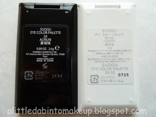
Last year, I spotted not one but two(!) Suqqu Eye Color Palettes on E(vil)bay for around $20 NIB with free shipping and snatched both up without hesitation: 03 蒼瑠璃 (Aoruri) and EX-05 澄茶墨 (Sumichazumi).
All pictures taken in natural light without flash.
Yes, you could call these nostalgic buys since I'm really missing Suqqu's old and sleek packaging. That said, I sure don't miss these suede storing pouches though. Urgh. They're lint magnets and they don't store well for sure.


- 03 蒼瑠璃 (Aoruri): this palette leans cool. I absolutely love that purplish mauve but wish the blue was darker. Right now, something feels "off" because the blue seems kind of warm to me.


- Top: base/highlighter, shimmer, very sheer. A chalky white that was really, erhhh, chalky for some reason (har har). I had to really dig at it just to get some color for the swatch.
- Center: medium, shimmer, medium intensity. Purplish mauve and absolutely gorgeous. Love this color!
- Bottom: medium/liner, shimmer, high intensity. An ocean blue that seems to clash with the cool tone of the rest of the palette as it swatches a little on the warm side with some green and gold. Also, I'd like my liner colors a little darker and this color is light enough to be used as a medium lid shade.
Seeing this palette in person immediately makes me think of EX-02 夜彩空 (Yosaizora), the same way 01 透橙石 (Toutouseki) resembled EX-06 花瑞樹 (Hanamizuki), and 02 金紫石 (Kinshiseki) to EX-21 紫水晶 (Murasakisuishou). So compared the two I did!
Funny enough, when I put 03 and EX-02 side by side, it occurred to me that the bottom pan of EX-02, also a blue, leans cool and seems to clash with the warmer tone of that palette as well. In fact, on its own EX-02 looks navy. However, next to the warmer blue in 03, the purple in EX-02 becomes apparent and it's more of a deep and purplish indigo to me, which kind of clashes with the other two pans, a warm pink-taupe and a pink-tinted white. Sure, they might have mixed some warmth in with the cool and vice versa for contrast and depth, but these color combos don't quite work for me.


So... I popped their bottom two blue pans out and swapped them ^.^ What do you think? Personally I like them better this way, with 03 a cool palette and EX-02 a warmer palette :)


- EX-05 澄茶墨 (Sumichazumi): I'd swatched EX-05 in store when it was released in Tokyo and didn't like it then. I still think it's kind of boring, but I'll admit it does look a lot better in natural light, in particular the bottom pan. Will elaborate below. Either way, I'm happy to have it now, especially at the price I did. They've discontinued these palettes for a few years now.


- Top: base/highlighter, shimmer, low intensity. A sparkling champagne gold.
- Center: medium/lid, shimmer, medium intensity. A golden beige.
- Bottom: liner, satin, medium intensity. A green-tinted charcoal that looks much better in person than it did when I swatched it in indoor lighting some years back. I think it was because the green tint disappeared in the yellow indoor lights and left this color a plain and boring charcoal.
03 蒼瑠璃 (Aoruri) and EX-05 澄茶墨 (Sumichazumi).


See my previous posts:


9 comments:
Lucky you! Actually I am glad I didn't see them, I would have gotten these at that price although these shades won't look good on me at all. I am still snooping on ebay occasionally in case toukiyou popped up again... I remember seeing Murasakisuishou on ebay for $50and just went "nah thanks" in my head.
yeah sometime ago the fall 2018 8pan was on bonboncosmetics for 60 bucks or so, and I thought it went on clearance for a reason.
Hey Mina,
LOL yeah I have zero restraint when it comes to a good deal.
Interesting that you don't like the 8-pan from fall 2018. I actually thought it was pretty and did buy it ^.^ I really like Murasakisuishou too! That said, as usual the UK LE 8-pan scared me way with the neon and super bright shades.
Interesting that you like Toukiyou. I prefer Himawari.
Cheers,
D.
I am just a blind follower on weibo and toukiyou was extremely popular on weibo. From the picture it's just a warm amber gold but the blue duochrome really gives an interesting shift. Now I am sad I missed it out totally.
Anyway, I still want to see your swatches on the 8-pan. It's the same reaction like fashion items , something I know at first sight just won't interest/work on me so I noped myself out right away. In Chinese people's response to those kind of stuff is
"打扰了"
Hey Mina,
That's hilarious. Why "扰"? I guess I'm reading it literally xD
I had that reaction with Toukiyou and the UK LE 8-pan, precisely because of the blue duochrome and the neons. I guess that just makes me super boring LOL
I did swatch the 8-pan and it's gorgeous! Very pigmented. I'm also 8 months behind on photos now--it's August 2019 now and I'm still on December 2018 photos T.T
Cheers,
D.
it's literally "pardon me" when you entered a club/room/place with people that have nothing to do with you. It's just like "noped my way out" in English...
Don't worry about 8 months behind. I still have suqqu palette I got from four years ago (and many blend color eyeshadow) I haven't touched...And Lunasol summer palettes from 2015, 2017, 2018 (OK i touched one of the two from 2018)...too many palettes too few lid space...
Hey Mina,
Cool. Nice to learn some new Mandarin terms ^.^ Is this a newish term/slang?
Ooohh which blend color eye shadows do you have that you haven't touched?
Cheers,
D.
Hmmm. For the ones I can remember
Hisuidama, konruri, kinshasuna, Usumoegi(OK that's not a lot for the blend color eyes) as for the new version I hoarded hikarigogare, ryogetsu, himawari, ryokosumosu and Akenatsu... There isn't much time in NJ/NY to wear eyeshadow as it's either sticky Wet or stone cold (in winter there are only two grayish taupe I reach forl.
Hey Mina,
OMG I'd love to see Usumoegi, or actually all of them ^.^ Do swatches first and then wear later?
But yeah, I do remember how hot and humid the east coast can get during the summer. Ick.
Post a Comment